
Overview
Donors of the American Red Cross experienced difficulty signing up to donate blood while using the organization's mobile app. The existing experience created unnecessary friction throughout the donation-booking journey, making it harder for donors to find, schedule, and manage appointments.
My role was to identify the key usability issues within the experience and develop a clearer, more intuitive mobile experience that aligned with how donors actually search for and schedule blood donations.
-
Role: UX Design Lead, responsible for research synthesis, experience strategy, interaction design, and development of the redesigned experience.
-
Teams: Collaborated across UX, product, development, and American Red Cross stakeholders to align user needs with organizational goals.
-
Timeline: ~ 6 months of research, design exploration, stakeholder collaboration, and iterative refinement.
-
Outcome: A streamlined donation-signup experience designed to reduce friction, improve appointment discovery and scheduling, and create a more accessible path for donors to complete the blood-donation journey.
Compounding Friction
The American Red Cross donation experience carried friction across several parts of the donor journey, and each issue made the others more difficult to resolve. As a product problem, donors encountered unnecessary obstacles when attempting to find and schedule blood-donation appointments through the mobile app. Important information was not always presented at the right moment, and the path from discovering an opportunity to completing a booking felt more complicated than it needed to be.
As a donor experience problem, the different pieces of the journey—finding a donation opportunity, reviewing available locations and times, selecting an appointment, and completing the sign-up process—needed to work together as one continuous experience. Instead, interactions could feel disconnected, creating additional cognitive load for donors who were simply trying to schedule a donation.
And as an organizational problem, the experience needed to balance the needs of donors with the operational requirements of the American Red Cross. Improving the journey wasn't simply about making individual screens look better; it required understanding the complete donation workflow and identifying where UX friction could prevent donors from completing their intended action.
The Challenge
The central challenge was straightforward: donors wanted to give blood, but the digital experience was making the process harder than necessary.
The opportunity was to rethink the experience from the donor's perspective rather than treating appointment scheduling as a collection of individual screens. By examining the journey end-to-end, I could identify opportunities to simplify navigation, improve information hierarchy, reduce unnecessary steps, and make the path to scheduling an appointment more intuitive.
Understanding the Donor Journey
I approached the problem by looking beyond individual interface issues and focusing on the broader experience of donating blood through the American Red Cross mobile app.
The goal was to understand where donors experienced uncertainty, where the interface created unnecessary effort, and where the product could provide clearer guidance. This shifted the conversation from simply addressing isolated usability issues to designing a more cohesive experience—one that helped donors move confidently from intent to action.
The resulting design direction focused on making the donation journey feel more straightforward, predictable, and accessible while keeping the needs of both donors and the American Red Cross at the center of the experience.
Approach
The work followed a repeatable arc: discover the problem, understand the donor experience, identify the gaps, develop a systems-level narrative, earn stakeholder buy-in, and design toward a better experience. Two artifacts did most of the persuading: a visualization of the donor journey and a narrative that connected individual UX problems into one cohesive story.
Understanding the donor experience
The research revealed that the challenge wasn't simply that donors were having difficulty navigating individual screens. The larger opportunity was understanding why donors struggled to move from the intention to donate to actually scheduling an appointment.
The existing experience introduced friction at several points in the journey—from finding a convenient donation opportunity and understanding available options to selecting an appointment and completing the sign-up process. By looking at these interactions collectively, I was able to identify patterns that weren't obvious when each screen was considered independently.
Rather than treating these as isolated usability issues, I reframed them as opportunities to create a more cohesive donor journey.
Illustrating the donation journey
The reframe was simple: donating blood is a journey, so the digital experience should support that journey as one continuous experience.
I mapped the donor experience from initial intent through appointment completion and beyond. The journey included discovering a donation opportunity, finding a convenient location, reviewing availability, selecting a time, confirming the appointment, and managing the donation experience.
This visualization helped shift the conversation from "How do we fix this screen?" to "How do we make the entire donation journey easier?"
Once the journey was visible as a connected system, individual usability problems became easier to prioritize within the larger donor experience.
Developing a systems-level narrative
To give each UX opportunity a clear place within the broader experience, I developed a narrative framework connecting the donor need, user goal, experience problem, product area, supporting research, and desired outcome.
This helped transform scattered usability observations into a cohesive product story. Instead of presenting individual design recommendations in isolation, each recommendation could be connected to a specific donor need and supported by research and behavioral evidence.
The result was a clearer vision for how improvements across the experience could work together to reduce friction and make blood-donation scheduling more intuitive.
The buy-in journey
Creating a better donor experience required more than designing new screens. It required building alignment around why the experience needed to change and where UX could have the greatest impact.
I worked with cross-functional stakeholders to socialize the research findings, identify the highest-friction moments in the donor journey, and translate those findings into actionable design opportunities. Through iterative conversations and collaborative exploration, the focus shifted from individual interface problems toward a broader vision for a more seamless donation experience.
The design direction ultimately centered on a simple objective: remove unnecessary friction between a donor's desire to give blood and their ability to schedule an appointment.
That became the foundation for the redesigned American Red Cross experience.
Customer Journey Mapping


AI Tools
I used Claude as a prototyping partner to accelerate and ideate during the discovery phase. 45 screens delivered in 72 hours of design time over 19 days - versus an estimated 375 hours for traditional Figma-only prototyping of the same scope - by working with Claude as a prototyping partner throughout.
What was created?
45 screens designed
15 user journeys
20 days to build and ideate
7 stakeholder demos
The Brief
The client's platelet and whole blood donors were facing a manual, multi-checkpoint, cumbersome onboarding process. They wanted to give their dedicated donor's an improved digital experience via the blood donation application. This platform is a crucial part of the Red Cross ecosystem was to eliminate friction from every journey a donor goes through from signing in to blood sample collection.
Week-One Prototyping
Built a first working prototype in 1 week for an initial stakeholder session at the client's offices with representatives from customer service, development and product.
Rapid Iteration
Grew the prototype to 44 screens across 14 user journeys over 20 days of iteration, updating every screen after each round of feedback from accessibility fixes to full flow changes.
Stakeholder Demos
Ran the prototype through 7 stakeholder demo sessions, including Legal, Marketing, Sales and Development.
Product Alignment
Held weekly feedback sessions with Product and leadership to align on direction, priorities and business capability.
UI Modernization
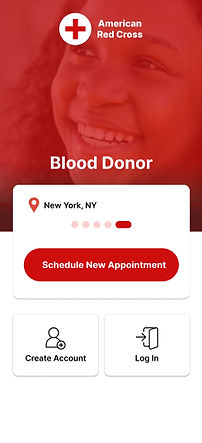
The legacy UI displayed outdated elements that needed to be addressed.
_edited.jpg)
_edited.jpg)
_edited.jpg)